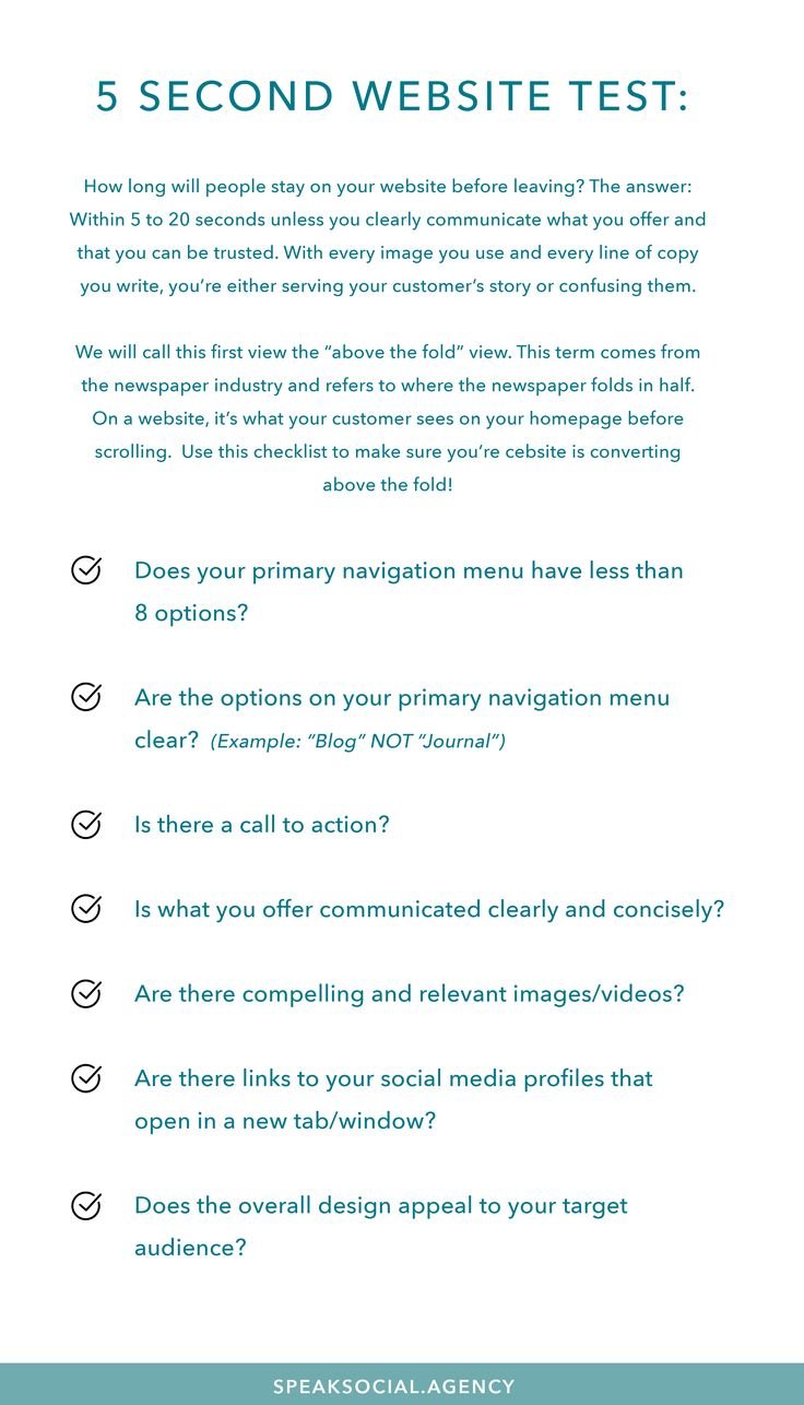
A website visitor forms an opinion within seconds after landing on a page. The 5 second website test helps businesses understand whether their website communicates its purpose, value, and trust quickly enough. If visitors cannot understand what a website offers immediately, they often leave without exploring further. A strong website first impression depends on clear messaging, effective above fold design, fast loading speed, and simple navigation. Improving these elements can reduce bounce rate, increase engagement, and create a better user experience.
Key Takeaways
- Visitors decide whether to stay on a website within a few seconds.
- Clear messaging improves website first impression and user trust.
- Poor design, slow speed, and unclear goals increase bounce rate.
- Above fold design plays a major role in visitor engagement.
- Regular testing helps identify why users leave websites quickly.
What Is the 5 Second Website Test and Why Does It Matter?
The 5 second website test is a simple usability method that checks what visitors understand after viewing a webpage for only a few seconds. It measures whether your website communicates its purpose, offer, and value clearly before users start reading deeper content. This test is important because online visitors have limited attention and many competing options.

A strong first impression can influence whether users continue browsing or leave immediately. Websites must deliver clarity before asking visitors for action. The first few moments often decide the entire customer journey.
How the Five Second Test Measures Website First Impression
A website first impression depends on how quickly users understand the page purpose. During a five-second test, users usually answer questions about what they noticed, remembered, and expected from the website. Their responses reveal whether your messaging and design are working effectively.
Visitors should quickly recognize the brand, service, or product being offered. Confusing headlines or crowded layouts can create uncertainty and encourage users to leave. The goal is to make every important element easy to understand.
What Visitors Should Understand Within Five Seconds
When someone visits your website, they should immediately understand who you are and what you provide. A successful homepage removes confusion and guides users toward the next step. Your website should answer important questions without requiring extra effort.
Visitors should identify:
- What your business offers
- Who your products or services are for
- Why they should trust you
- What action they should take next
A clear headline, supporting message, and visible call-to-action create better user experiences. These elements help visitors feel confident about exploring more pages.
Why Visitors Leave Websites Before Reading Anything
Many businesses lose potential customers because visitors leave before discovering their products or services. The reasons are often connected to poor design decisions, unclear communication, or technical problems. Understanding why visitors leave website fast helps improve overall performance.
User behavior is influenced by psychology, convenience, and trust. When a website fails to meet expectations quickly, visitors usually search for another option. Small improvements can create significant engagement changes.
Poor Website First Impression Creates Instant Exit Decisions
A weak website first impression can damage credibility within moments. Visitors judge professionalism through design quality, content clarity, and overall appearance. If the page feels outdated or confusing, users may assume the business is unreliable.
Modern websites need simple layouts and focused messaging. Too many distractions can prevent visitors from finding important information. A clean structure helps users understand the brand quickly.
Common Bounce Rate Causes That Drive Users Away
A high bounce rate often indicates that visitors are not finding what they expected. Several factors can cause users to exit quickly instead of continuing their journey. Identifying these problems helps website owners make better improvements.
| Problem | How It Affects Visitors |
|---|---|
| Slow loading speed | Users lose patience and leave |
| Unclear headline | Visitors cannot understand the purpose |
| Poor navigation | Users struggle to find information |
| Weak call-to-action | Visitors do not know what to do |
| Mobile issues | Users experience frustration |
These bounce rate causes are common across many industries. Fixing them improves usability, satisfaction, and conversions.
The Role of Above Fold Design in Visitor Retention
Above fold design refers to the section users see before scrolling down a webpage. This area has a powerful impact because it creates the first visual and emotional response. A strong above-the-fold section immediately communicates value and encourages visitors to continue.
The best designs balance visuals, messaging, and functionality. Every element should support the main purpose of the page. A cluttered first screen can quickly reduce visitor interest.
Elements Every Above-The-Fold Section Needs
A successful above fold design includes essential elements that guide visitor attention. The headline should explain the main benefit clearly without complicated language. Supporting text should provide additional context while keeping the message simple.
Important elements include:
- A clear and benefit-focused headline
- A short supporting description
- A noticeable call-to-action button
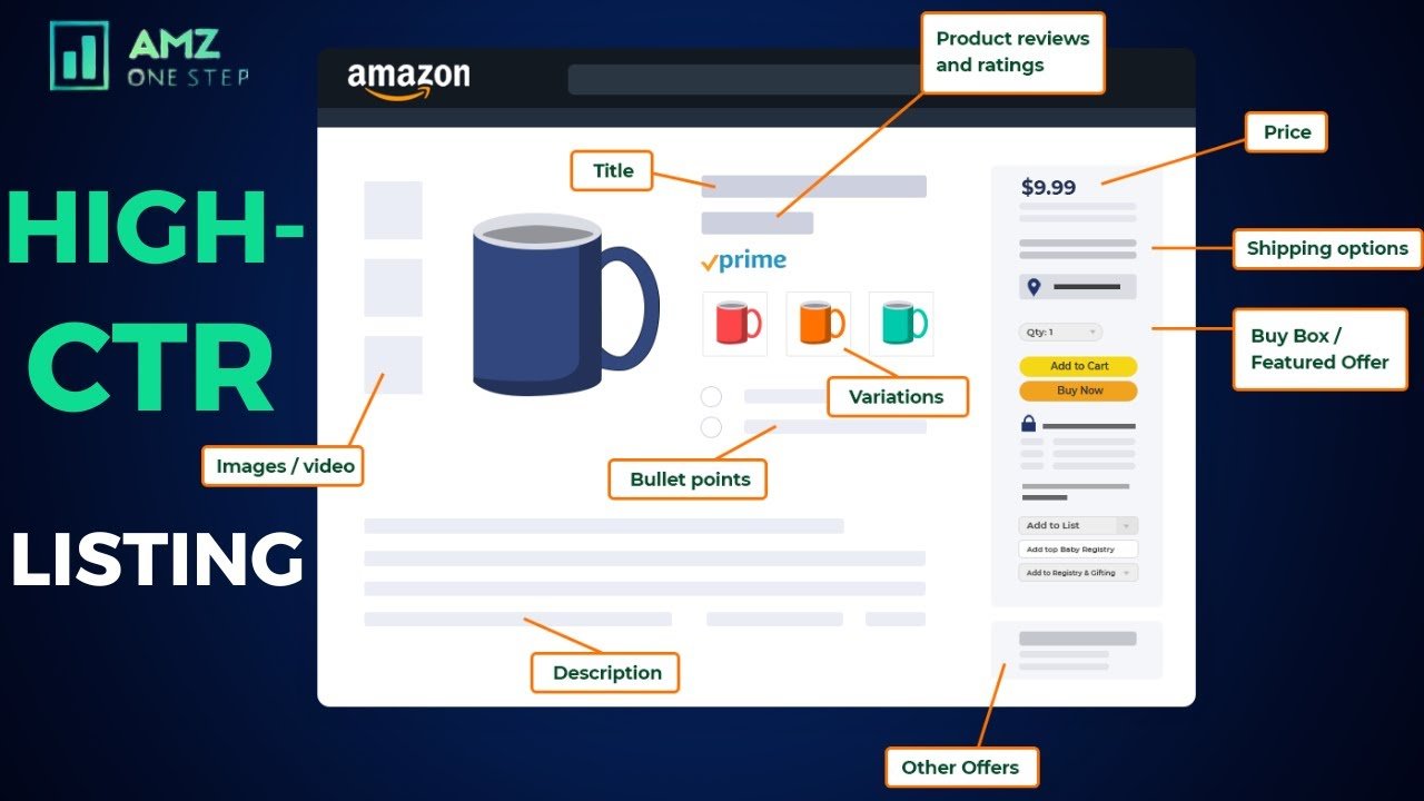
- Trust signals such as reviews or credentials
- Relevant visuals
These elements help visitors understand the website without unnecessary searching. Good design creates confidence and encourages further interaction.
Above Fold Design Mistakes to Avoid
Many websites fail because their first screen contains too much unnecessary information. Large blocks of text, confusing menus, and unclear buttons can overwhelm visitors. The first section should guide users instead of creating distractions.
Common mistakes include:
- Hidden contact information
- Too many competing messages
- Weak visual hierarchy
- Missing customer benefits
A focused design helps users make decisions faster. Every homepage element should support the visitor’s main goal.
How to Perform a Five Second Website Test Successfully
Testing your website does not require complicated processes. The purpose is to discover what real users understand within a short viewing period. Their feedback can highlight problems that business owners may overlook.
A proper test provides valuable insights about website clarity. It helps improve content, design, and conversion strategies based on real visitor reactions.
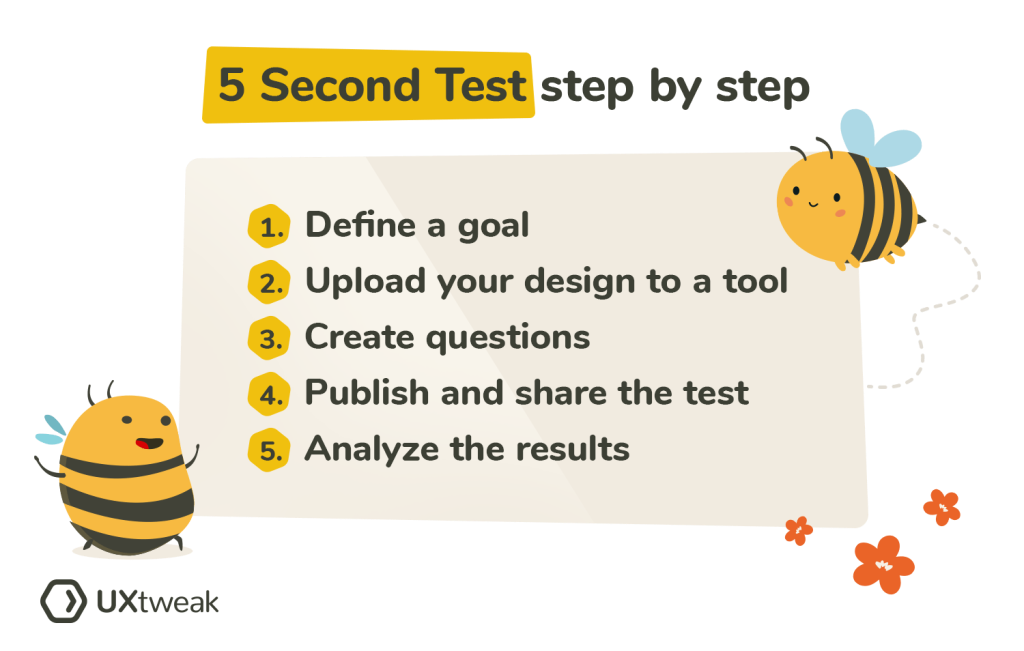
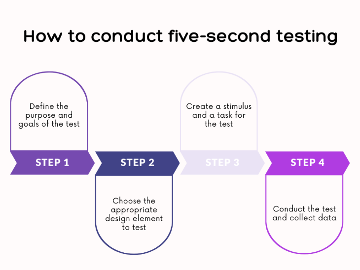
Step-by-Step Five Second Website Testing Process
A simple testing process can reveal important website issues. First, show users your webpage briefly without explanation. Then ask what they remember and what they think the website provides.
Follow these steps:
- Display your website for five seconds.
- Ask users about their first impression.
- Review their answers and identify confusion.
- Improve unclear sections.
- Test again after making changes.
Continuous improvement creates a stronger user experience. Testing should become part of your website optimization routine.
Tools and Methods for Testing Website Clarity
Businesses can use different methods to understand visitor behavior. User feedback platforms, analytics tools, and heatmaps provide useful information about website performance. These methods help identify areas where visitors lose interest.
Website owners should combine testing data with customer feedback. Numbers explain what happens, while user comments explain why it happens. Together, they create better optimization decisions.
How to Improve Your Website After the Five Second Test
After completing testing, the next step is improving weak areas. Website optimization should focus on clarity, speed, trust, and user needs. Small changes can create noticeable improvements in engagement.
A successful website always evolves based on visitor behavior. Regular updates help businesses maintain better experiences and stronger conversions.
Improve Messaging and Value Proposition
Your value proposition should explain why visitors should choose your brand. Avoid complicated statements and focus on customer benefits. Clear communication helps users understand your offer immediately.
Use simple language that connects with audience problems. A strong message creates relevance and encourages visitors to explore more. Good content supports both users and search engines.
Optimize Design for Better Engagement
A user-friendly design improves interaction and reduces frustration. Websites should load quickly, work smoothly on mobile devices, and provide easy navigation. These factors influence both user satisfaction and search performance.
Google’s helpful content approach rewards websites that provide valuable experiences. Combining SEO practices with user-focused design supports long-term growth.
Conclusion
The first few seconds of a website visit can determine whether someone becomes a customer or leaves forever. The 5 second website test helps businesses identify whether their website communicates value clearly and creates confidence instantly. Improving website first impression, above fold design, and user experience can significantly reduce unnecessary exits.
A successful website requires continuous testing, meaningful content, and visitor-focused improvements. Brands like Brandsholder understand the importance of building digital experiences that connect with audiences and support stronger online growth. By applying these principles, businesses can create websites that attract attention, build trust, and encourage action.
Frequently Asked Questions
What is the 5 second website test?
The 5 second website test is a usability method that checks what visitors understand after viewing a webpage briefly. It helps identify problems with messaging, design, and user experience.
Why do visitors leave websites quickly?
Visitors often leave because of slow loading speed, unclear messaging, poor navigation, or a confusing layout. A weak first impression can reduce engagement immediately.
How does above fold design affect conversions?
Above fold design affects conversions because it controls the first interaction users have with a website. Clear headlines and visible actions encourage visitors to continue.
What causes a high website bounce rate?
Common causes include irrelevant content, technical problems, poor mobile experience, and unclear website goals. Fixing these issues can improve visitor retention.
How can I improve my website first impression?
You can improve your website first impression by creating clear messaging, improving design quality, increasing speed, and making navigation simple.