
Landing Page Design is very important for online marketing. A well-designed landing page can turn visitors into customers. Many businesses lose potential clients because of poor design. In this article, we will explain 12 elements that help pages convert.
Visitors decide quickly whether to stay or leave. This makes landing page design a key part of online success. Every choice on a page affects trust and conversions. Using these tips can improve engagement and leads.
What Is Landing Page Design?
Landing page design is more than looks. It guides visitors to take a specific action. Good design uses visuals, text, and structure together. Every choice affects conversions, from colors to buttons. Design also tells users what your brand stands for. It helps visitors move toward your goal easily. Users should understand your offer right away. Clear and simple design keeps visitors focused.
A good landing page makes decisions easy. It removes distractions and highlights the main goal. The goal can be signing up, buying, or downloading. Landing page design shapes user actions and success. It also builds trust and confidence. Good pages can increase ROI without more traffic. Testing keeps your design working well. Clean, simple pages help users stay longer.
Why Landing Page Design Matters for Conversions
Design impacts conversion rate optimization (CRO) directly. A bad page can push visitors away fast. Users want clean layouts, clear messages, and fast loading. Good design helps visitors see your value quickly. Cluttered or confusing pages lose attention fast. Good design gives a strong first impression. Every choice affects whether visitors stay or leave. Visual cues, buttons, and spacing guide users naturally.
Design also builds trust. Visitors feel safe when information is clear. Mobile-friendly layouts improve user experience. Even great offers fail without proper design. Professional-looking pages make users more likely to act. Proper images and headings improve engagement. Small changes can boost conversions a lot. Simple tweaks often give big results.
12 Must-Have Elements of High-Converting Landing Page Design
Here are 12 essential elements every landing page should have. Each one helps drive conversions. They focus on looks, clarity, and persuasion. Using them makes your page meet visitor needs. Good design mixes psychology with visuals. Following these tips improves page performance. Let’s go through each element and why it matters. Strong pages get more engagement, trust, and sales.
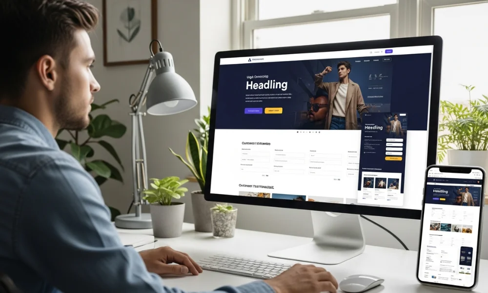
Compelling Headline & Subheadline
The headline is the first thing people notice and should communicate value immediately. A well-crafted subheadline supports the main message and explains the benefits clearly. Headlines need to be short, easy to read, and informative, telling users what to expect. Using tools like RenderNet AI can help generate compelling headlines quickly and efficiently. Good headlines grab attention fast and, when keywords are used wisely, also improve search engine visibility.
Headlines should mix clarity and curiosity. Avoid hard or confusing words. Subheadlines explain the solution briefly. Together, they make a strong first impression. Good headlines make users read further. They also improve SEO naturally. Test different headlines to see what works best. Headlines decide visitor interest quickly.
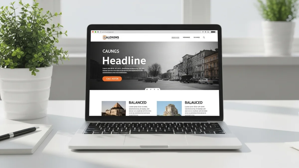
Engaging Hero Section: Landing Page Design
The hero section is the first visual area on a page. It usually has an image, headline, and CTA. This is where users decide to stay or leave. A strong hero section shows the main benefit fast. Hero sections explain your value in seconds. Images or videos are as important as text. Users decide quickly if the page is worth it. Strong hero sections build trust immediately.
Use good-quality images or videos. Keep text short and easy to scan. The hero section sets the tone for the page. It should be clear and easy to understand. Include a CTA in the hero section for instant action. It should answer “why should I care?” fast. Testing different hero sections improves results. A good hero section keeps visitors longer.
Clear Value Proposition
Visitors need to know why your offer matters. A value proposition answers this fast. It explains the problem you solve and how you’re different. Value propositions guide visitors toward action easily. Without clarity, visitors leave without acting. It must be easy to see and understand. A strong value proposition lowers bounce rates. It also sets you apart from competitors.
Focus on benefits, not features. Use short and clear sentences. Use images to reinforce your point. Make sure your proposition solves the main user problem. This builds trust and encourages action. Update your proposition if needs change. Unique benefits make your brand memorable. Keep it short but strong for impact.
Effective Call-to-Action (CTA)
CTAs are the most important elements for conversions. They tell users what to do next. Placement, color, and words matter a lot. Best practices for call-to-action buttons explain how to make them effective. CTA buttons should stand out and be clear. Too many buttons confuse users. One clear CTA often works best. The CTA must match the headline message. Use a color that contrasts with the page background.
Examples are “Get Started” or “Download Now.” Place CTAs above the fold for visibility. A good CTA makes users act right away. Test different colors and text to find the best. Adding urgency can increase clicks. CTAs should also work well on mobile. Secondary CTAs can help optional actions.
Design Elements That Boost User Experience
Social Proof & Trust Signals: Landing Page Design
Users trust other people more than brands. Social proof includes reviews, testimonials, or client logos. Trust signals show your reliability. Social proof increases visitor confidence and conversions. Adding verified stats or reviews helps credibility. Well-known brands increase trust. Testimonials make users relate to past customers. Social proof reduces hesitation to act.
Use client logos, success stories, or certifications. Keep testimonials short and clear. Mix text and images for more impact. Social proof reassures visitors and encourages engagement. Video testimonials feel more real. Case studies give more details. Update social proof to keep it relevant. Show numbers or stats for extra trust.
Benefit-Focused Copywriting
Your text should focus on benefits, not just features. Keep paragraphs short and simple. Use friendly and clear language. Benefit-focused copy explains value in a simple way. Show the results users can expect. Storytelling connects with users emotionally. Short sentences make it easier to read. Highlight why your product matters personally.
Use keywords naturally, like high-converting landing pages. Subheadings help visitors scan the page. Good copy builds trust and encourages action. Break text with visuals or small bullet points if needed. Always think about user intent. Clear copy guides visitors to convert. Effective copy can decide if a visitor acts immediately.
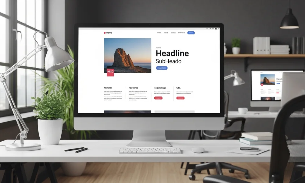
Visual Hierarchy & Imagery: Landing Page Design
Visual hierarchy helps users understand what is most important first. Elements like size, color, and position guide attention effectively, while good images support the overall message. Visuals make content easier to read and encourage action. Balancing text and images ensures clarity, and using arrows or lines can direct the eye naturally.
Maintaining a consistent style and color scheme also boosts brand recognition. For strategies on comparing tools that enhance local marketing visuals, check out BrightLocal vs Local Falcon. Well-chosen images can create emotion that drives user engagement and action.
Hierarchy affects usability, not just looks. Important things should stand out. Images can explain faster than text sometimes. Icons and infographics help understanding. Test image placement to improve clicks. Cohesive visuals look professional and build trust.
Minimalist & Clutter-Free Layout
Cluttered pages overwhelm users. Minimalism highlights important content. Remove anything unnecessary. Simple layout makes pages clear and easy. White space improves reading and focus. Prioritize elements that matter most. Minimalist design meets modern user expectations. Simple pages also load faster.
Every element should have a purpose. Avoid purely decorative items. Clean design helps users scan and act quickly. Group similar content together. Consistent spacing and alignment guide attention. Minimalist pages improve engagement and conversions.
Technical and Performance Elements

Mobile Optimization: Landing Page Design
Many visitors use mobile devices. A responsive design works on all screens. Buttons, forms, and images must resize. Mobile optimization keeps leads and improves engagement. Poor mobile pages lose users fast. Test your page on different devices. Make buttons easy to tap. Mobile-friendly design also improves SEO.
Simplify content for small screens. Large images should scale well. Responsive pages drive more conversions effectively. Avoid pop-ups that block mobile users. Users should complete actions in a few clicks. Fast and clear mobile pages keep users longer.
Fast Loading Speed
Slow pages annoy visitors and lower conversions. Optimize images, scripts, and hosting. Small delays reduce engagement. Fast pages create good first impressions and keep users. Use caching and compress images. Test speed regularly with tools to test website speed for accurate results. Visitors expect fast pages on all devices.
Fast pages help SEO, too. Optimized speed improves search rankings consistently. Remove unnecessary scripts or plugins. Use CDNs for global speed. Small improvements increase conversions and reduce bounce rates.
Simple Forms to Reduce Friction
Long forms stop people from submitting. Ask only essential info. Use clear labels. Short forms improve conversions quickly. Inline validation reduces mistakes. Avoid multi-step forms unless needed. Show progress for longer forms.
Test form placement for best results. Make buttons clear and visible. Easy forms let users complete actions fast. Auto-fill helps convenience. Review metrics to see where people drop off.
A/B Testing & Optimization
No design is perfect at first. Test headlines, colors, and layout. Optimization is ongoing. Testing improves page performance over time. Track CTR, bounce, and conversions. Small changes can make a big difference. Continuous testing gives long-term success. Test different variations to find the best.
Test one change at a time. Optimized pages convert more visitors without extra traffic. Use data, not guesswork. Iterative changes make landing pages stronger over time.
How to Prioritize Elements for Better Results

Not all elements matter equally. Focus on high-impact items first. A simple table helps:
| Element | Conversion Impact | Priority |
|---|---|---|
| Headline & Subheadline | Very High | Top |
| CTA | Very High | Top |
| Social Proof | High | Medium |
| Hero Section | High | Medium |
| Forms | Medium | Medium |
| Mobile Optimization | High | Top |
| Copywriting | High | Medium |
| Visual Hierarchy | Medium | Medium |
| Minimalist Layout | Medium | Medium |
| Loading Speed | High | Top |
| Value Proposition | Very High | Top |
| A/B Testing | Very High | Continuous |
This shows where to spend effort first. Testing high-impact elements gives best results.
Common Mistakes in Landing Page Design
Avoid these common mistakes:
-
Too many CTAs
-
Generic stock images
-
No mobile optimization
-
Feature-heavy copy with no benefits
Fixing these improves conversions. Always review design from the user’s perspective.
Best Tools & Templates for Landing Page Design
Tools can make landing pages easier:
-
Unbounce – Drag-and-drop + A/B testing
-
Leadpages – Templates for high conversion
-
Webflow – Fully customizable pages
-
Instapage – Built-in analytics
Use templates to save time. Add your brand style. Analytics ensures constant improvement.
Conclusion: landing page design
Landing page design decides if visitors become leads. Focus on 12 key elements for high conversion. From headlines to A/B testing, details matter. Implementing these improves trust, experience, and conversions. Review pages and make changes today. Good design equals more conversions and business growth.
Simple pages, strong CTAs, and trust elements build results. Test and improve continuously. Start optimizing today and watch conversions grow.