
A single bad user experience will make 88% of SaaS users abandon your product forever. But here’s the bright side – your conversion rates can increase by 400% with a well-designed SaaS UI. The quality of your saas ui design makes users stay or leave in a digital world with nearly 1.88 billion websites and 5.5 million apps competing for attention. Your product’s success depends on becoming skilled at SaaS UI UX design – it goes beyond aesthetics to create interfaces that turn visitors into loyal customers.
This piece reveals proven SaaS design strategies that boost conversions. You’ll learn to create a SaaS interface design that keeps users coming back and accelerates business growth by building effective design systems and optimizing conversion points.
Key Elements of High-Converting SaaS UI Design
A high-converting SaaS UI design relies on three basic elements that influence user behavior and prompt action.
The visual hierarchy that drives action
Visual hierarchy in SaaS interface design guides users’ attention through smart element placement. A well-laid-out visual hierarchy boosts comprehension by up to 20% and directs users toward key conversion points. Proper spacing and size variations create clear pathways that lead users through the interface.
On top of that, it establishes focal points through contrasting elements to highlight vital features and calls to action. This approach helps users process information quickly, which makes the interface more user-friendly and action-oriented.
White space and content density
White space plays a vital role in SaaS design and shapes how users interact with your interface. You should think about two distinct types of white space:
- Macro white space: Creates breathing room between major sections and content blocks
- Micro white space: Defines relationships between individual elements and improves readability
The right use of white space improves legibility and helps users process complex data better. This thoughtful spacing builds visual authority and credibility before users take any action.
Color psychology for conversions
Color selection in SaaS UI UX design does more than look good – it shapes user behavior and conversion rates directly. Research shows that smart color choices can increase conversion rates by up to 26%.
Understanding color associations is vital for SaaS design:
- Blue evokes trust and reliability, perfect for financial or data-sensitive applications
- Green suggests growth and harmony, ideal for productivity tools
- Red creates urgency and excitement, effective for call-to-action elements
Color’s effect goes beyond individual elements. A cohesive color palette, limited to 5-7 core colors, creates visual harmony while maintaining brand recognition. This approach to color guides users through the interface and builds stronger emotional connections with your product.
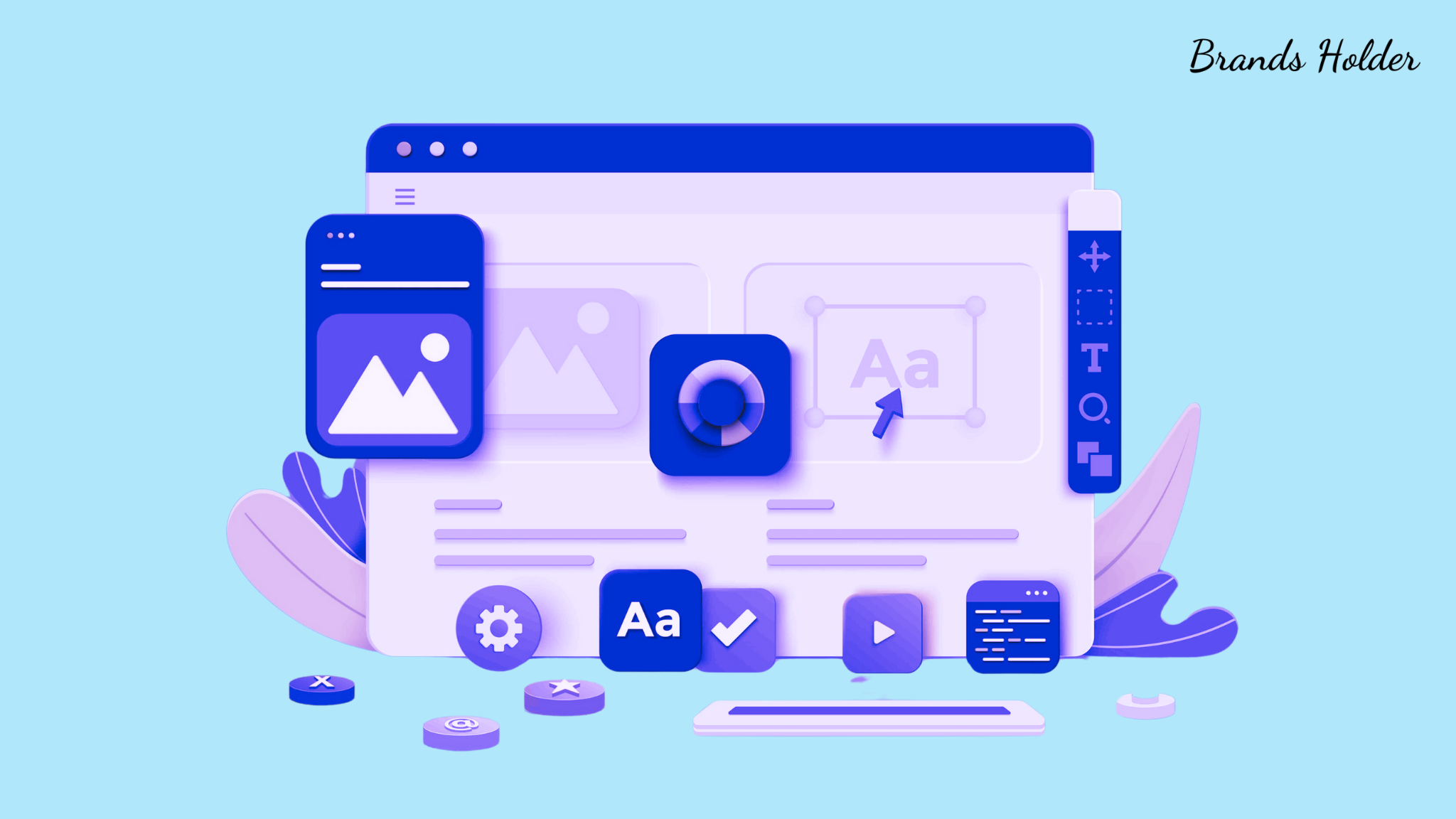
Building Your SaaS UI Design System

A reliable design system is the backbone of successful SaaS UI design. We focused on consistency and scalability. Design systems help teams create cohesive user experiences everywhere.
Core components library
Teams need to identify and standardize frequently used interface elements to build a complete component library. These components are building blocks for your SaaS interface design that will give a consistent look and reduce development time.
The core components library should include these UI elements:
- Navigation elements (menus, breadcrumbs)
- Input controls (buttons, text fields, dropdowns)
- Data display components (tables, cards, charts)
- Feedback indicators (alerts, progress bars)
- Layout containers (grids, panels)
Each component needs proper documentation that details its purpose, usage guidelines, and code implementation. This documentation helps team members understand how to use components correctly.
SaaS UI Design: Design tokens and variables
Design tokens are the foundations of your design system and store visual design attributes in a centralized repository. These tokens work as key-value pairs that define everything from colors and typography to spacing and animations.
Design tokens fall into three distinct levels:
Primitive Tokens: These represent the most simple design values that reduce infinite possibilities to brand-relevant choices. To cite an instance, defining primary colors, typography scales, and spacing units.
Semantic Tokens: These carry meaning and context that indicates how and where specific values apply. They create relationships between tokens and establish meaningful connections.
Component Tokens: These tokens are specific to individual UI elements and reference semantic tokens to maintain consistency across components.
Design tokens bring several advantages to SaaS UI UX design. Changes to token values automatically update across all components. This centralized approach to design decisions ensures consistency and reduces maintenance time by a lot.
Teams store tokens in JSON files, which they can transform and merge across platforms of all sizes. This approach creates a single source of truth for design decisions and streamlines designer-developer collaboration.
Design tokens excel in theming scenarios. Separate token groups for different themes make switching between visual styles easy. This flexibility is a great way to get results for SaaS products that need multiple brand implementations or dark/light mode support.
Crafting the Perfect SaaS UI Design Homepage
Your SaaS product’s homepage acts as its digital storefront and plays a significant role in your UI design strategy. Research shows that visitors take just 5 seconds to form their first impression of your homepage.
Above-fold optimization
Users decide to stay or leave based on your above-fold section. A well-laid-out above-fold area should clearly explain your value proposition and guide visitors through your conversion funnel.
Your above-fold design should focus on these elements:
- Headlines that speak to user pain points
- Quality visuals showing your product
- CTAs are positioned with a clear value proposition
- Quick load times to keep users engaged
Mobile optimization is vital since mobile devices make up 59% of web traffic. Your design should adapt naturally across screen sizes with fast load times. Studies show that 53% of mobile users leave sites that take more than three seconds to load.
Social proof placement
Social proof can drive conversions effectively on your SaaS homepage. The drop-off rate between first and second fold ranges from 30-50%. This makes it vital to display social proof above the fold.
Add these social proof elements:
- Logos from prominent brands
- Statistics showing real impact
- User testimonials
- Third-party ratings and reviews
- Industry awards and certifications
Social proof elements need smart placement. Put them near conversion points like trial signup forms and demo request buttons. Your testimonials should be specific and detailed. They should highlight actual benefits instead of generic praise.
SaaS UI Design: Feature showcase patterns
A good feature showcase turns technical specs into relatable benefits. The best SaaS homepages tell a story about solving problems and streamlining processes instead of just listing features.
Structure your feature presentation to match your buyer’s experience. Start with features that help in decision-making, then add more details as users scroll down. Product demos or screenshots can boost feature demonstrations by showing clear functionality.
Note that simple language works better than technical jargon when showing end benefits. This helps visitors grasp your product’s value quickly and motivates them to take action.
Optimizing Key Conversion Points
SaaS UI design success depends on three crucial conversion points that affect user involvement and retention rates.
Sign-up flow design
A smooth sign-up process affects conversion rates directly. Research shows that forms with four or fewer fields boost conversions by 120% compared to those with 11 fields.
The registration process should collect only basic details like email and password. Users should share additional information as they use your product. This works better because users see the real value through hands-on experience.
These proven elements will boost your sign-up experience:
- Single Sign-On (SSO) options to cut friction
- Quick feedback for form validation
- Clear progress indicators
- Mobile-optimized form design
Pricing page patterns
A well-crafted pricing page boosts conversions by showing clear value and building trust. Complex pricing structures push away potential leads who might have reached out to sales.
The best pricing pages share common elements. They show fewer pricing plans to help users decide faster. Smart highlighting draws attention to plans that offer the most value or bring in maximum revenue.
Your credibility grows when you add these trust signals:
- Industry awards and certifications
- Real customer feedback
- Well-known client logos
- Performance metrics
Call-to-action optimization
CTAs might look simple, but their design and placement affect conversion rates by a lot. Eye-catching CTAs with powerful microcopy help leads take the next step – whether they sign up for a free trial or buy a subscription.
Great CTA optimization needs smart placement and design choices. Action-focused copy drives user response, and proper color contrast makes buttons stand out. Focus on one or two main actions per page instead of overwhelming users with multiple CTAs.
Put CTAs where users expect to take action naturally. Add clear calls-to-action right after you show value propositions or feature demos. This lines up with how users make decisions and makes conversions more likely.
CTAs work better when you look beyond design. A/B testing helps you find what works best with your audience. You can optimize button placement, copy, and design elements through regular testing and tweaking to get more conversions.
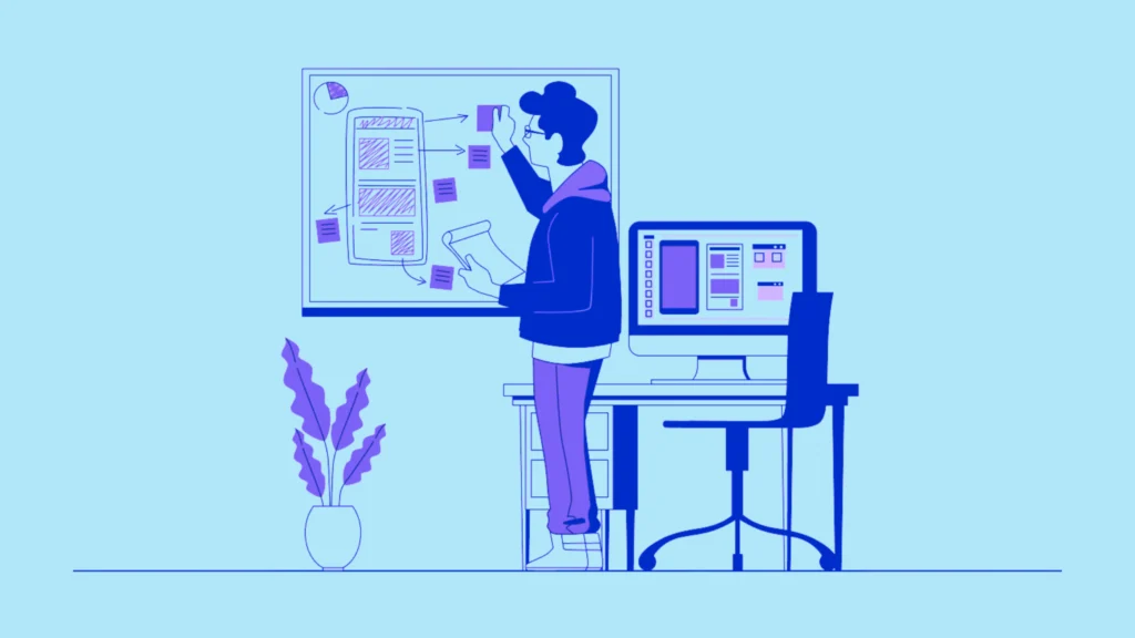
Data-Driven Design Decisions
Good design decisions come from solid data collection and analysis. We based successful SaaS UI design on understanding how users behave and making changes backed by real evidence.
Setting up analytics tracking
Google Analytics 4 (GA4) gives detailed insights into how users interact with your SaaS platform. GA4’s event-based tracking system records user interactions, from feature usage to in-app actions.
Your analytics implementation should:
- Track key user actions like sign-ups, logins, and feature usage with custom events
- Segment data by subscription types and user roles using user properties
- Track conversions to measure product performance
- Measure across platforms to analyze unified user behavior
GA4’s machine learning predicts future user behavior. This helps you spot potential drop-offs and high-value customers early.
A/B testing framework
A/B testing helps prove design decisions right. Research shows that a well-laid-out testing framework converts more traffic and cuts bounce rates.
The quickest way to A/B test follows four steps:
- Validation: Set clear goals, establish baselines, and record hypotheses
- Elaboration: Test scientific hypotheses with controlled experiments
- Iteration: Build more variant tests based on first results
- Implementation: Apply winning changes to product design
A/B testing works. A SaaS platform boosted user participation by 27% with better onboarding flows. Another doubled first-day friend requests through systematic testing.
SaaS UI Design: User behavior analysis
Understanding user behavior patterns is the lifeblood of informed design. Behavior analytics covers several data collection methods:
Quantitative Analysis: Page views, click-through rates, and bounce rates show how users interact. This data reveals how users move through your interface and where they struggle.
Qualitative Research: User interviews and on-page surveys help find friction points. This adds context to numbers and reveals why users do what they do.
Path Analysis: See how users interact before and after specific events. This helps spot bottlenecks and ways to improve your SaaS interface design.
Informed insights help enhance customer support and success. SaaS providers can spot common problems and help users who need extra support by analyzing their interactions.
The data-driven design creates lasting improvements. Teams can spot popular features, find unused functions, and focus on development that matches user needs through constant data collection and analysis. This approach ensures your SaaS UI design grows based on real user behavior, not guesswork.
Mobile-First SaaS Interface Design
Mobile devices generate over 64% of web traffic. This reality has transformed how we design SaaS UIs. Teams now need a mobile-first mindset that puts smaller screens first in the design process.
Responsive patterns
Responsive design helps your SaaS interface adapt naturally to screens and devices of all sizes. Designers must build fluid grids and flexible layouts that adjust automatically to different viewport dimensions throughout development.
The most effective responsive patterns have three key breakpoints:
- 360px for smartphones
- 768px for tablets
- 1024px for desktop displays
Mobile screens offer limited space, so content prioritization is vital. The mobile-first approach pushes designers to focus on essential features first. This creates stronger foundations that scale up effectively to larger screens.
A responsive design that works needs several key elements:
Fluid Layouts: Design elements should flow naturally and adapt to different screen sizes without breaking the interface structure. This approach makes content available whatever the device orientation or screen dimensions.
Progressive Enhancement: Starting with mobile lets you add features systematically as screen size grows. You won’t fall into the trap of cramming desktop functions into mobile views.
Content Adaptation: Keep all content visible on mobile when possible. The better approach is to restructure it for smaller screens using expandable sections or progressive disclosure techniques.
SaaS UI Design: Touch-friendly elements
Mobile interfaces depend on touch interactions. Getting the size and spacing right is vital for usability. Studies show that 53% of users leave websites when touch interactions don’t work well.
Button Dimensions: Touch targets need specific sizes to work well. The guidelines state buttons and interactive elements should be at least:
- 44×44 pixels for Apple devices
- 48×48 density-independent pixels for Android platforms
Spacing Considerations: Interactive elements need enough space between them to prevent wrong taps. This spacing should balance usability with efficient screen use.
Ergonomic Placement: Touch targets work best in the lower-middle part of the screen. This matters because most users hold their devices with one hand.
Interaction Feedback: Users need immediate visual cues for their touch actions. Color changes, animations, or haptic feedback confirm that something happened.
Touch-friendly elements go beyond just size and space. Designers should think about different interaction patterns:
Gesture Support: Swipe, pinch, and tap gestures make mobile interactions feel natural. These gestures should match platform standards that users already know.
Navigation Patterns: Mobile apps often use hamburger menus or bottom navigation bars that users can reach easily. The key is to keep placement and behavior consistent across all screens.
Form Optimization: Mobile forms work best when they ask for essential information only. This cuts down on user friction and helps more people complete forms.
SaaS applications that put mobile-first design principles first deliver great experiences on all devices. This approach serves the growing mobile user base and creates focused, efficient interfaces for everyone.
Conclusion
A high-converting SaaS UI design requires careful attention to several interconnected elements. Teams can create compelling interfaces that guide users toward desired actions by implementing visual hierarchy, white space, and color psychology strategically.
Design systems are the foundations that ensure consistency and speed up development. The right homepage optimization combined with simplified processes turns visitors into loyal customers. Informed decisions based on complete analytics and A/B testing help refine these elements according to real user behavior, not assumptions.
A fundamental change to mobile-first design reflects current priorities. Touch-friendly elements and responsive patterns have become crucial. SaaS UI design succeeds when technical requirements and user needs work in harmony to create interfaces that feel natural on every device.
Note that exceptional SaaS design does more than look good. Component libraries and conversion optimization are vital parts that create experiences to propel business development. These strategies and best practices will help you build interfaces that strike a chord with users and produce measurable results.