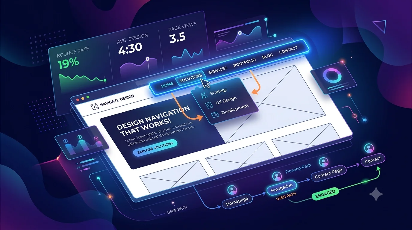
When someone lands on y. They may want to learn about our website, they have something in mind about your service, compare pricing, read an article, or contact your business.
If they can’t figure out where to go, they usually will not waste time looking . They leave.
That is why navigation matters. It’s not just the menu at the top of a webpage. It is how you show people what your website offers, where to find the important stuff, and what they should do next.
Set up your navigation well can make your site easier to use, helps with Google , and stop people from leaving right away navigation problems. It can also make your website feel more trustworthy from the first click.
In this guide, you will learn how to build site navigation that is simple, useful, good for Google, looks good on the phones, and easy for real people to use
AI Overview
Good website navigation SEO makes it easier for people and Google to understand your site. A simple top menu helps people find important pages, while good links inside your pages help Google see how everything connects
To keep people around, keep your menus simple, use names that make sense, put important pages first on mobile, and tell people what to do next.
Key Takeaways
- Keep your menu simple and find things fast
- Use clear, menu names everyone gets.
- set up your menu in a way that makes sense.
- Put important pages where people can see them.
- Optimize navigation for mobile users.
- Use internal links to strengthen navigation SEO.
- Avoid unnecessary dropdowns and menu clutter.
- Keep navigation the same across your website.
- Always tell people what to do next.
- Test your navigation with real users.
Why Website Navigation Matters
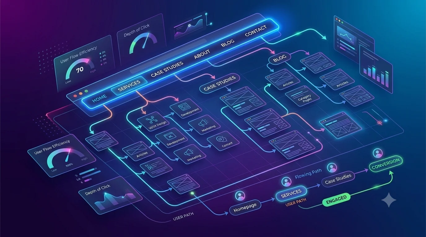
Navigation is not just a row of links stuck at the top of your site.
Think of it like a map.
When someone lands on your homepage, they should instantly get what your site about and where to find more info
For example, a service business could use:
Home → Services → Case Studies → About → Blog → Contact
An online store might use:
Home → Shop → Categories → New Arrivals → Best Sellers → Contact
The exact setup depends on your audience and business, but the main idea is the same: make it clear what to do next.
Good navigation also supports SEO because when you link between your pages, Google can find them and see how. is connected to how different sections of your website are connected.
What matters most is this: good navigation stops people from getting frustrated. If people can find the page they need without thinking too hard way more likely to stick around
Menu Structure Website: Keep It Simple and Logical
A good menu structure website should help people understand what’s on your site and where to find it in a few seconds.
Your main menu doesn’t need to include every single page on your website. Honestly , trying to cram everything into the tap bar just makes the site harder to use.
Start with the pages your people actually need.
For example:
Home | Services | Case Studies | About | Blog | Contact
If your site has many pages, group similar stuff together into a clear section. You can use dropdowns when they group similar stuff together into clear sections
The important thing is to organize your menu around what people need, not how your company is set up. For example, most customers don’t care which department handles what. They just want to know what you offer and where they can find it.
Before adding a menu item, ask:
“Would someone visiting for the first time understand why this page is here?”
If the answer is no, the item may not belong in your main menu.
Navigation SEO: Help Users and Search Engines
Navigation Seo is not about stuffing your menu with keywords. It is about setting things up so it works for both people and google Use menu names that actually tell people the destination page. For example, SEO Services tell users much more than just such as “Solutions.”
Internal links are also important. If you have a blog article about SEO, you can link it to related stuff such as keyword research, technical SEO, or your SEO services page.
This way you create a clear path:
Blog Article → Related Guide → Service Page → Contact
The links should always make sense in context. Do not add links simply because you want to use a keyword.
A useful navigation system helps visitors discover more relevant content while making the relationship between your pages easier to understand.
How to Reduce Bounce Rate With Better Navigation
If visitors come to your website and do not know what to do next, they may leave before clicking around.
This is where better navigation can help reduce bounce rate and keep visitors exploring your website.
Your navigation should answer one simple question:
“Where can I go from here?”
Imagine someone visits your service page. They may want to see proof of your work before contacting you.
A natural path could be:
Service → Case Study → Pricing → Contact
Someone reading a blog post might instead follow:
Blog Article → Related Article → Service Page
The goal is not to force visitors to open more pages. The goal is to make the next useful steps easy to find.
You can also use contextual links, related-content sections, breadcrumbs, and clear calls to action to guide visitors naturally.
When people do not have to search for their next step, there is less friction in their journey.
Website Nav Best Practices: Make Navigation Easy to Use
Following practical website nav best practices can really improve how people use your site.
Start with names people already know. Use Services instead of a vague term like “Solutions” if your visitors won’t get what it means right away what it means.
Keep your main navigation consistent across the site so visitors always know where to find important sections.
Your navigation should also work well on mobile. Menu items should be easy to read and tap, and users should not have to keep the same on every page.
Another useful practice is to make your main button easy to find. Depending on your business, this could be:
Get a Quote | Book a Call | Start a Project | Contact Us
Finally, test your navigation with someone who’s never used your website before.
Ask them to find your services, pricing, or contact page. If they pause or keep clicking around without finding it, you’ve got a real problem. Good navigation is not about adding more stuff. It is about making the right options easier to find.
Make Your Navigation Mobile-Friendly
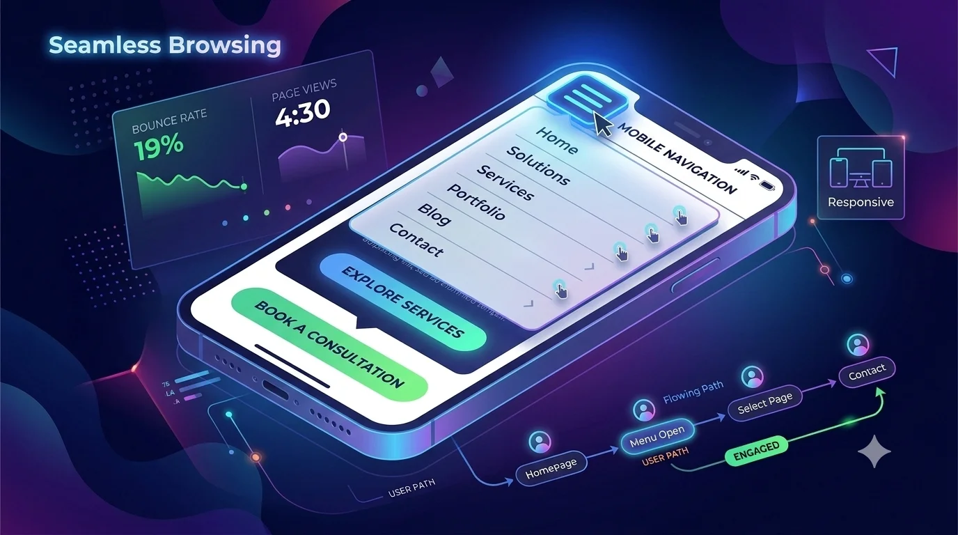
A navigation system can look great on a computer and still be a pain to use on a phone. phone users have less screen space and use their fingers to tap. Small links, crowded dropdowns, and messy menus can quickly ruin the experience.
Make sure your mobile navigation:
- Has an obvious menu button
- Uses readable text
- Has comfortable tap targets
- Keeps important pages accessible
- Avoids unnecessary submenu levels
- Opens and closes smoothly
Do not simply shrink your desktop navigation and assume it will work on mobile.
Think about the experience from the visitor’s perspective:
Can someone find the page they need while using your website on a small screen?
If not, simplify the menu.
Use Dropdowns Without Creating Confusion
Dropdown menus are useful when you have several related pages.
For example:
Services
SEO
Web Design
Content Marketing
Social Media Marketing
This keeps the main navigation clean while still letting people get to specific services. The problem starts when dropdowns become huge lists.
A menu containing dozens of links can stop people and get confused about what to choose. If a category needs too many options, consider creating a separate page instead.
Use dropdowns to organize related information, not to stuff your whole website inside one menu.
Use Internal Links to Improve Navigation
Your header menu is only one part of your navigation system. Internal links throughout your content can guide people to other helpful info.
For example, an article about homepage optimization might naturally link to another guide about conversion optimization or a relevant web design service.
These people keep reading instead of leaving the reader at a dead end. Internal links can also support navigation SEO by helping search engines see how your pages are connected between pages.
The key is relevance. A link should be there because it helps the reader, not because you need to insert another keyword.
Keep Navigation Consistent
Imagine your homepage has this menu:
Services | About | Blog | Contact
Then you open a blog article and suddenly see:
Solutions | Resources | Company | Start Here
That creates unnecessary friction.
Visitors should not have to learn a different navigation system every time they open a new page.
Keep your primary navigation consistent in:
- Position
- Labels
- Order
- Design
- Behavior
Consistency builds familiarity. Once visitors understand your website, they can move around it more confidently.
A Simple Website Navigation Structure
Here is an example of a clean structure for a service-based business:
| Navigation Element | Purpose |
| Home | Introduces the business |
| Services | Explains what you offer |
| Case Studies | Builds credibility |
| About | Establishes trust |
| Blog | Provides helpful information |
| Contact | Creates a conversion path |
| CTA Button | Encourages the primary action |
This is only the start. Your menu should match who you’re talking to, what you post, and how your business works.
Common Navigation Mistakes That make people leave
Even a nice looking site can lose people if the navigation is bad.
Too many menu items: A cluttered menu makes it hard to see what actually matters.
Vague names: Words like “Explore” or “Discover” can leave people guessing what’s inside.
Hidden important pages: If pricing, services, products, or contact info are hard to find, people will probably leave.
Poor mobile navigation: Tiny links and complicated menus just annoy people.
Too many dropdown levels: Deep navigation makes simple tasks feel complicated.
Inconsistent menus: Changing navigation between pages makes the website harder to learn.
Ignoring internal links: Visitors may finish one page without having an obvious next step.
Navigation built only for the company: Your menu should reflect how customers think, not how your internal departments are organized.
How to Test Your Website Navigation
You do not need an expensive usability study to find basic navigation problems.
Ask someone who has never used your website to complete three simple tasks:
1.Find your main service.
2.Find your pricing or product information.
3.Find your contact page.
Then watch what they do.
Do they find everything immediately?
Do they hesitate?
Do they click the wrong option?
Do they ask you where something is?
These reactions can reveal problems that are easy to miss when you already know your website.
You can also review analytics and user-behavior data to identify pages where visitors frequently leave or stop progressing. The goal is simple: find the points where visitors get stuck and make those paths easier.
Secondary Keyword Guide
| Secondary Keyword | What It Means | How to Improve It |
| Menu structure website | Organizing important pages into a clear hierarchy | Keep categories logical and remove unnecessary menu items |
| Navigation SEO | Making navigation useful for visitors and search engines | Use descriptive labels and relevant internal links |
| Reduce bounce rate navigation | Using clear navigation to encourage visitors to continue exploring | Provide relevant next steps and easy-to-find pages |
| Website nav best practices | Practical principles for creating usable navigation | Keep menus simple, consistent, mobile-friendly, and easy to understand |
These four areas work together. A logical menu structure website improves usability, strong navigation SEO helps organize your content, better navigation can help reduce bounce rate navigation, and website nav best practices keep the entire experience simple.
Conclusion
Great website navigation is about making the next step clear. People should be able to find important pages without getting lost, whether they are on a computer or their phone
Keep your menu simple, use names that make sense, strengthen navigation SEO with helpful links inside your pages and follow practical website nav best practices. When visitors can move through your website naturally, you create an easier time moving around and give them more reasons to stay.
If you are working on improving your website structure and overall brand experience, you can also review your related work through Brandsholder.
The best navigation is simple, useful, and almost effortless to use.
Frequently Asked Questions
What is website navigation design?
Website navigation design is the process of organizing menus, links, buttons, breadcrumbs, and other navigation elements so visitors can easily find information and move through a website.
How does navigation reduce bounce rate?
Clear navigation helps people avoid confusion and helps visitors quickly find relevant pages. When people can easily stay longer and look around instead of getting stuck, they have more opportunities to explore the website.
Does website navigation affect SEO?
Yes. Navigation and internal links can help search engines find all your pages. Understand how pages are connected between different sections of a website. A clearer setup also makes important content easier to reach.
How many items should be in a website menu?
There is no universal number that works for every website. Keep the main menu focused on the most important pages to your visitors. If adding another item makes the menu look messy, consider moving it into a relevant dropdown, category, or footer.
What is the most important website navigation best practice?
Clarity is one of the most important principles. Visitors should understand what each navigation option means without having to guess. Simple structure, descriptive labels, make it work on phones, keep it the same , and useful internal links all contribute to better navigation.