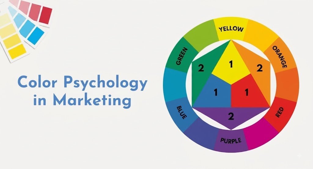
Color is one of the first things people notice when they see a brand. Before customers read your message, explore your website, or learn about your product, your colors can already create an impression. That is why color psychology in marketing matters. The right colors can make a brand feel trustworthy, professional, energetic, creative, friendly, or premium. The wrong combination can make a brand feel confusing or disconnected from its audience.
Choosing brand colors is not simply about picking your favorite color. A strong color strategy should match your brand personality, target audience, industry, and marketing goals. This color marketing guide explains how color influences branding, how to choose brand colors, and how to use them to create a stronger visual identity and support conversions.
Color psychology in marketing is the use of colors to influence how people perceive a brand and respond to marketing messages. Different colors can create different associations, but their impact depends on factors such as audience, culture, industry, design, and context. To choose brand colors that convert, businesses should consider their brand personality, target audience, industry, and marketing goals. A strong palette can include a primary color, supporting colors, and an accent color that helps important elements stand out.
There is no universal best color for conversion. The most effective choice depends on the brand, audience, design, offer, and overall user experience.
Key Takeaways
- Color psychology in marketing can influence brand perception and customer behavior.
- Choose colors that match your brand personality and target audience.
- Consider your industry when creating your color palette.
- Use a primary color with supporting and accent colors.
- Keep your colors consistent across your website, social media, and advertisements.
- Use strong contrast to make important elements easier to notice.
- Avoid using too many unrelated colors.
- Do not choose colors only because you personally like them.
- There is no universal best color for conversion.
- Test your color combinations to see what works best for your audience.
What Is Color Psychology in Marketing?
Color psychology in marketing is the study of how colors can influence people’s emotions, perceptions, and behavior toward a brand or marketing message. Different colors can create different associations. For example, blue is often associated with trust and professionalism, while red can communicate energy, urgency, or excitement.
However, color meanings are not universal rules. People’s reactions can vary based on culture, personal experiences, context, design, and the way a color is combined with other visual elements. For marketers, the goal is not to find one “magic” color. The goal is to choose colors that support the message and personality your brand wants to communicate.
For example, blue is often associated with trust and professionalism, while red can communicate energy, urgency, or excitement, a pattern rooted in broader color psychology research.
Why Color Matters in Marketing
A strong visual identity can help people recognize a brand more easily. Consistent colors across a website, social media, advertisements, packaging, and other marketing materials can make a business look more professional and memorable.
Color can also guide attention. For example, an accent color with strong contrast can make an important call-to-action button or offer stand out from the rest of a page.
When color is used intentionally, it can help visitors understand what deserves their attention and where they should take action. This is why brand color psychology can be an important part of a complete marketing strategy.
Brand Color Psychology: What Different Colors Can Communicate
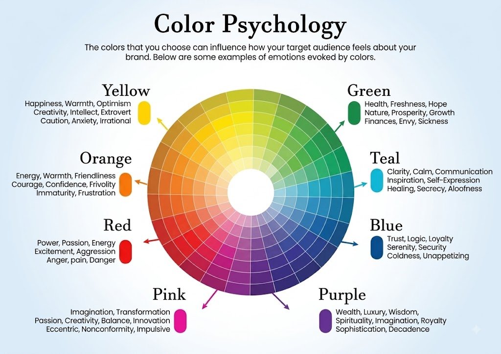
Colors can create different feelings and associations. However, color meanings are not fixed rules. The final impression can change depending on the shade, combination, industry, culture, and overall design.
| Color | Common Meaning | What It Can Communicate | Common Marketing Use |
| Red | Energy, passion, urgency | Excitement, confidence, action | Promotions, sales, food, entertainment, call-to-action buttons |
| Blue | Trust, stability, calmness | Reliability, security, professionalism | Technology, finance, healthcare, corporate brands |
| Green | Growth, nature, freshness | Health, sustainability, balance | Health, wellness, environmental, organic brands |
| Yellow | Happiness, optimism, attention | Positivity, friendliness, energy | Children’s brands, creative businesses, promotions |
| Orange | Enthusiasm, creativity, warmth | Fun, confidence, friendliness | Lifestyle, entertainment, e-commerce, action-focused brands |
| Purple | Creativity, luxury, imagination | Premium quality, originality, sophistication | Beauty, luxury, creative, premium brands |
| Black | Power, elegance, sophistication | Authority, exclusivity, premium quality | Luxury, fashion, technology, premium products |
| White | Simplicity, cleanliness, clarity | Openness, minimalism, modern style | Healthcare, technology, fashion, minimalist brands |
How to Choose Brand Colors That Convert
Choosing brand colors requires more thought than selecting colors that simply look attractive. Your colors should support your brand and make it easier for customers to understand what you offer.
1. Understand Your Brand Personality
Start by asking:
What should people feel when they see my brand?
Do you want your brand to look:
- Professional
- Friendly
- Energetic
- Premium
- Creative
- Simple
- Modern
- Trustworthy
Your answers can help you decide which color direction fits your brand. Once you’ve defined this personality, it’s worth carrying the same tone into your written voice too our guide on developing a unique brand voice covers how to keep messaging aligned with your visual identity.
For example, a professional service may prefer a calm and trustworthy palette, while a creative brand may use brighter and more expressive colors.
2. Know Your Target Audience
Your customers should influence your color choices. Think about who you are trying to reach and what visual style they may respond to. Consider their age, interests, expectations, culture, and the type of product or service you provide.
A color palette designed for a children’s brand may look very different from one created for a financial service. Understanding your audience makes choosing brand colors more strategic.
3. Consider Your Industry
Your industry can also influence color selection. Some colors are strongly associated with particular industries because customers repeatedly see them in similar businesses. This does not mean you need to copy competitors.
Instead, understand the visual expectations of your market and find a balance between fitting your industry and standing apart from competitors.
4. Choose a Primary Brand Color
Your primary color should represent the main personality of your brand. It may appear in important parts of your visual identity, such as your logo, website elements, social media graphics, and marketing materials.
Choose a color that works well across different platforms and can be used consistently. Your primary color decision often ties directly into your logo design our breakdown of brand vs logo explains how these two elements work together to form your identity.
5. Add Supporting Colors
One color is usually not enough for a complete brand identity. Supporting colors can create contrast and help organize your designs. You can use them for backgrounds, secondary elements, icons, headings, or other visual details.
A simple palette often looks more professional than using too many unrelated colors.
6. Select a Strong Accent Color
An accent color can help important elements attract attention.
You might use it for:
- Call-to-action buttons
- Special offers
- Important links
- Product highlights
- Key information
The goal is to create a clear visual hierarchy without making the entire design feel overwhelming.
Best Colors for Conversion
There is no universal best color for conversion. A color that works well for one brand may perform differently for another because conversions depend on many factors, including the audience, design, offer, copy, placement, and context.
Instead of asking:
“Which color converts the most?”
A better question is:
“Which color makes the desired action clear for my audience?”
For example, a call-to-action button should be easy to notice and have enough contrast with its background.
The color itself is only one part of the overall customer experience.
How Color Can Improve Conversion
Color can support conversions in several ways.
Create Attention
A contrasting color can draw attention to an important element on a page.
Improve Visual Hierarchy
Different colors can help users understand which information or actions are most important.
Build Brand Recognition
Consistent colors can make your brand easier to recognize across different marketing channels.
Support Trust
A suitable color palette can reinforce the personality and positioning of your business.
Encourage Action
A noticeable, well-contrasted action button can make the next step easier for visitors to identify.
These benefits show why color should be treated as part of your marketing strategy rather than simply as decoration.
Color Marketing Guide: Use Colors Consistently
Once you choose your brand colors, consistency becomes important.
Use the same core colors across:
- Website
- Logo
- Social media
- Advertisements
- Email marketing
- Packaging
- Business materials
Consistent use helps create a recognizable visual identity.
If your website uses one color palette, your social media uses completely different colors, and your advertisements follow another style, customers may find it harder to connect those experiences with the same brand.
Avoid Choosing Colors Only Because You Like Them
Personal preference can be a common mistake when choosing brand colors.
You may love a particular color, but that does not automatically mean it is right for your audience or business.
Instead, consider:
Brand personality + target audience + industry + readability + contrast + marketing goal
This approach creates a more purposeful color strategy.
Test Your Brand Colors
Even carefully selected colors should be tested.
Try different versions of your palette and observe how people interact with your designs.
You can test:
- Button colors
- Background colors
- Headline colors
- Advertisement designs
- Landing pages
- Social media creatives
The goal is not to prove that one color is universally better. The goal is to discover which combination works best for your specific audience and situation.
Common Mistakes When Choosing Brand Colors
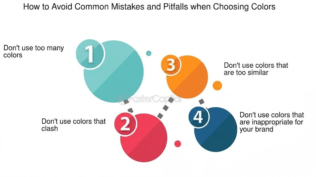
Using Too Many Colors
Too many colors can make a design look confusing and reduce visual consistency.
Ignoring Contrast
Text and buttons need sufficient contrast to remain easy to see and use.
Copying Competitors
Using exactly the same colors as competitors can make your brand difficult to distinguish.
Following Trends Blindly
A trendy color may look attractive today but may not match your brand personality or remain useful over time.
Changing Colors Frequently
Constantly changing your brand palette can weaken recognition and consistency.
Conclusion
Color psychology in marketing can help businesses create stronger brands, communicate personality, guide attention, and support customer action. The key is not to search for one color that magically increases conversions. Instead, choose brand colors based on your brand personality, target audience, industry, and marketing goals.
A strong color palette should communicate the right message, provide good contrast, remain consistent across your marketing, and make important actions easy to notice. When used strategically, color becomes more than a design choice. It becomes an important part of your brand communication and color marketing strategy.For more branding and marketing insights, visit Brandsholder.
Frequently Asked Questions
What is color psychology in marketing?
Color psychology in marketing is the use of colors to influence how people perceive a brand, feel about a product, and respond to marketing messages. Different colors can create different associations, such as trust, energy, growth, or luxury.
How do I choose brand colors?
To choose brand colors, consider your brand personality, target audience, industry, and marketing goals. Select a primary color and combine it with supporting and accent colors that create a clear and consistent visual identity.
What is brand color psychology?
Brand color psychology focuses on how the colors used by a business can shape customer perceptions and communicate the personality or positioning of the brand.
What are the best colors for conversion?
There is no single best color for conversion. The right color depends on your audience, website design, offer, industry, and context. Strong contrast and clear visual hierarchy are often more important than choosing a specific color.
Why are brand colors important?
Brand colors help create recognition, communicate personality, attract attention, and maintain consistency across different marketing channels such as websites, social media, and advertisements.
How many colors should a brand use?
A brand can start with a simple palette consisting of a primary color, supporting colors, and an accent color. Keeping the palette focused can make your branding look more consistent and professional.
Should I test different brand colors?
Yes. Testing different color combinations can help you understand what works best for your specific audience. You can test colors on buttons, landing pages, advertisements, and other marketing materials.